
Intuitiv Digital awarded ISO / IEC 27001 Certification
Intuitiv Digital are very pleased to announce we have been awarded ISO / IEC 27001 Certification on the 21 May 2026.

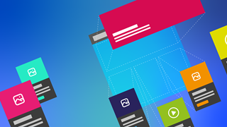
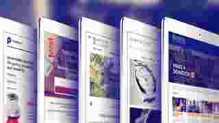
Is Your Website Holding You Back?
Your website might look fine on the surface — but if it’s not driving real business outcomes, it could be quietly costing you leads, credibility, and growth.

How Much Does an Umbraco Website Cost? 2025 Guide
Looking to build an Umbraco website in 2025? Find out the cost and everything you need to know in our comprehensive guide. Get started now!

Umbraco Vs Kentico: Comparing CMS Platforms
Compare Umbraco vs Kentico CMS platforms in this informative breakdown. Find out which one suits your needs best and make the right choice for your website today!

Umbraco Vs Joomla: Comparing CMS Platforms
Trying to decide between Umbraco and Joomla? We compare both CMS platforms on features, scalability, flexibility, cost, and developer support.

Umbraco Vs Sitecore: Comparing CMS Platforms
Struggling to choose between Umbraco and Drupal? We compare both CMS platforms on features, ease of use, flexibility, security, and cost.

Umbraco Vs Drupal: Which CMS is Right for Your Business?
Struggling to choose between Umbraco and Drupal? We compare both CMS platforms on features, ease of use, flexibility, security, and cost.

Planning Your Umbraco Website: Key Steps to Success
At Intuitiv Digital, we specialise in helping businesses navigate this complex planning process. With years of experience in Umbraco development, we ensure that your website not only meets your expectations but also delivers real business results.

Crafting the Perfect Landing Page: Design Tips for Higher Conversions
A high-converting landing page is more than just a pretty design. It features a clear objective, compelling headlines, persuasive content, and strong CTAs. Design elements like simplicity, intuitive navigation, and visual appeal are crucial in keeping visitors engaged and driving conversions.

Embark on Your Digital Journey with Ease: Exploring Umbraco Starter Kits
Umbraco Starter Kits simplify your digital journey, helping you launch your project quickly and efficiently.

Strategic Partnerships for Digital Success The Umbraco Partner Advantage
Umbraco provides its partners with exclusive access to premium resources, comprehensive training, advanced insights into upcoming new developments, and dedicated support.

Elevate Your Online Presence: The Oxford Web Agency Advantage
In today's cutthroat digital marketplace, an effective online presence is essential for business growth and engaging customers.

Crafting Digital Excellence: Your Go-To Web Design Agency in Oxford
Discover why Intuitiv Digital is a leading web design agency in Oxford. Elevating your website's success with our knowledgable team.

How does Umbraco work?
Wondering how Umbraco works? Read our guide to learn what you need to know.

Differences between Shared Hosting and VPS Hosting
Differences between Shared Hosting and VPS Hosting
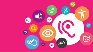
What is accessibility in web design and how important is it?
Want to know about accessibility in web design and its importance? Read our guide to learn what you need to know.
Custom Website Design vs Template Website - What's the difference?
Custom Website Design vs Template Website - What's the difference?

What's the difference Between Domain Name and Web Hosting?
Are you wondering about the difference between web hosting and a domain name is? Read our guide to learn what you need to know.

Umbraco vs Wordpress: What's the difference?
Umbraco vs WordPress – which CMS suits your needs best? Read our guide to learn key differences, pros, and cons to help you make the right choice.

Shared vs Dedicated Hosting - Which one is right for your website?
Are you thinking about shared or dedicated website hosting? Read our guide to learn what you need to know.
Responsive web design vs adaptive web design
Are you wondering about responsive and adaptive web design? Read our guide to learn what you need to know.

Website security guide
Is your website secure? If you’re unsure about the security of your website you need to read our guide.

Advantages of responsive web design
Are you looking for the benefits of responsive web design? Read our guide to learn what you need to know.

Introductory guide to website hosting
Meta Description: Looking to host your website? If you’re unsure of what to do then read our introductory guide on website hosting
Guide to Umbraco hosting requirements
Unsure of how to host your Umbraco site? Find out all of the options available to you and the best ones that meet your needs with our guide

What are the most popular content management systems?
Unsure what CMS to use? Find out what the most popular CMS platforms are and what they provide with our expert guide
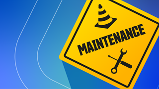
What is website maintenance: A complete guide
What is website maintenance? Learn what it is as well as the benefits and the costs involved with our expert guide.

Tips for a Successful Website Launch
Helpful tips and advice for planning, preparing and launching your new website.

How does mobile app development differ from website development?
Looking to develop a mobile app? Find out all you need to know about the differences between app and site development with our expert guide.

Ecommerce Website Development Guide
Looking to develop your ecommerce site? Find out all you need to know with our expert guide.

What is mobile first website design?
Looking to develop your ecommerce site? Find out all you need to know with our expert guide.
8 Principles of Good Website Design
A business needs an effective website and this calls for good website design. We will tell you all you want to know about good website design in this article.

Guide to the principles of mobile web design
We tell you all you want to know about mobile web design practice, so you can implement it effectively. We are Intuitiv, a leadingB2B website design agency with plenty of experience creating mobile-friendly websites.
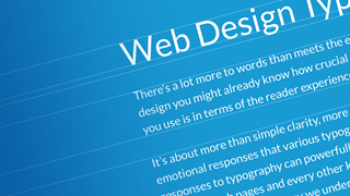
Guide to Typography in Web Design
Find out about the impact typography has on web design and common mistakes with our helpful guide.

5 examples of bad website design and how to avoid it
Learn why web design is so important and how you can avoid making common costly mistakes.

Things to consider when looking for a local web design agency
7 things to consider when looking for a local web design agency

What are the different website design services
Learn all of the different types of web design and which one is right for your business with our helpful guide.

What is Umbraco Cloud - Guide to Umbraco Hosting
Discover what Umbraco Cloud is, how it works. Learn about Umbraco Cloud Hosting features, pricing, and benefits to see if it’s the right choice.

Guide to the Best Umbraco Plugins
Learn about the best Umbraco plugins, called packages, and how they extend the capabilities of Umbraco.

The Importance of Website Speed
Learn why website speed is important and find out how to test a site along with what can be done to speed it up.

Web Design vs Web Development - Business Owners Guide
Find out what you need to know about both web design and web development and why you need an Oxford agency providing a full range of services.

Beginners Guide to Understanding Umbraco
Find out what you need to know about Umbraco, what it is and what the CMS is used for.

How to Transfer Website Hosting
Learn what you need to know about how to Transfer a Website to a new hosting service.

How a New Design can Boost Your B2B Ecommerce Sites Sales
See how a B2B eCommerce Website redesign will boost your online sales and lead generation.

Umbraco Custom Design vs Umbraco Templates
Learn more about Umbraco Templates and the pros and cons of both custom and template based site design.

Why Having a Website Backup is so Important
Find out why it’s essential to Backup your Website to enable easy restoration when required.

Umbraco 9 and Intuitiv's new Starter Pack.
Umbraco version 9 and how Intuitiv's new Starter Pack helps our developers kickstart your website project, taking it to a whole new world of excellence.

A Guide to Accessibility Web Design
Learn what you need to know about accessibility web design, what it is and why its important.


How to Create an e-learning Platform
Learn what you need to know about building a successful e-learning platform.

What are the Benefits of Having an e-learning Platform
Learn more about the benefits of e-learning platforms and how they are being used by businesses to save money and succeed.

Features Of CMS Programmes
Learn about the various features and capabilities provided by various popular CMS programmes.

Maximise Sales with a Black Friday Ecommerce Strategy
Learn what you need to do to make certain your Black Friday ECommerce Strategy delivers the results you need.

How To Design A Logo For Your Website
Learn how to design an attractive logo for your website that people will love and remember.

Why Choose Dedicated Website Hosting
Find out why dedicated website hosting may be the right choice for your business.

Bespoke Web Design Packages
We are experienced experts providing professional, bespoke web design packages that consistently exceed customer expectations. Contact us today.

Graphic Design Services Oxford
Discover expert graphic design services in Oxford. Our creative agency brings your ideas to life with logo design, custom projects, and digital graphics.

Dynamic Web Design Company
Experienced Dynamic Website Design Company based in Oxford providing a full range of professional digital design services. Contact us today.

How to write a web design brief
Find out how to write the best web design brief to get the website that you need for your business.

7 Reasons to Choose Umbraco
Learn why so many are choosing Umbraco as their website CMS.

Why you need Umbraco Forms
Learn about Umbraco Forms and how this facility enables easy form creation to capture the data you need.

What is Umbraco Heartcore?
Learn about Umbraco Heartcore and what this headless CMS provides.
Ecommerce with Umbraco
Discover how Umbraco Ecommerce empowers businesses with flexible, scalable, and customisable solutions. Learn about packages, templates, and integrations.

The ultimate guide to web design for start-ups
Intuitiv are experts in website design for start-ups. Read our top tips and tricks for online product or services marketing.

12 key steps to building a great small business website
As professional developers, we know how to create great sites. Now you can discover the critical steps for building a website which will fuel your growth.

Umbraco vs Wordpress
Read our comparison of Umbraco with Wordpress to help you decide on the right CMS for you.

What does it mean to be Umbraco Certified?
Find out what you need to know about Umbraco certification, what it means, how it's achieved and more.

How To Choose a Web Design Agency
Looking to find a web design agency but don't know where to start? Read 20 tips and helpful considerations so that you can make an informed choice.

We understand the needs of Oxford's small businesses
Find out how we understand the needs of Oxford's small businesses, enabling us to deliver competitive, successful websites.

How to find the best Oxford web designers for your business
Follow our simple process and you will find the best Oxford-based web designers for your business.

What's the best CMS for small businesses?
Which CMS system should you use for your site? Every business needs something that is easy and reliable. Find out what solution is best for your needs here.

Our Umbraco website design process
Discover our Umbraco website design and build process, from initial concept to launch, creating intuitive websites that engage and delight visitors.

Free B2B website design template
Free website design template PSD download from award-winning web design agency. Neutral design so it's more flexible and useful. Enjoy!

These 16 top tips will improve your website copy now
Engage and convert your users with our 16 essential top tips for writing better website copy.

Did Intuitiv achieve Umbraco Certified Partner status?
Did Intuitiv achieve Umbraco Certified Partner status?

What makes a good web developer?
What makes a good web developer? Spoiler: it's not just caffeine and biscuits.

Can a website design agency borrow from Agile software development?
How can a website design agency borrow from the Agile methodology of software development? How very dare they?

Your free easy-to-use checklist for a successful website
Here is your checklist to make sure your website keeps working hard for you and your brand. Includes free PDF download.
Intuitiv Digital to become an Umbraco Certified Partner
We’re excited to announce that Intuitiv Digital will become an Umbraco Certified Partner – an even higher accreditation than our existing Registered Umbraco Partner status!
The extraordinary evolution of web design – 2009 to 2019
The changes we've seen over the past decade have been profound. Here's our take on the past ten years of web design.

An SEO blog post gets all existential
Some not-so-obvious SEO techniques that have worked particularly well for us over the last few months. It does get a bit weird in the middle though.

Essential timings and tasks infographic of recent website build
A snazzy infographic, highlighting the essential stages of a typical build for a small to medium website driven by an Umbraco CMS.

How much does it cost for a website design?
Oxford website design agency, Intuitiv Digital, look at the variables that effect the cost of website design in the UK.

What happens if you don't have secure hosting?
A blog post by Oxford digital agency Intuitiv exploring the perils of not having secure hosting and some of the biggest cyber attacks so far in 2019.

Umbraco 8 - how a fantastic CMS just got even better
An insightful look at working with the new update to Umbraco that's been five years in the making.

Is your business website responsive?
Don't lose money - is your business website as responsive as it needs to be? Read our latest post on responsive web design.

Why Umbraco CMS is Crucial to your Website
10 reasons why an Umbraco Content Management System is crucial to your business website, by Oxford web agency Intuitiv Digital.
10 tips for a successful website redesign
10 essential tips for a successful website redesign, by Oxford web design agency Intuitiv Digital.